The ggmice package
The ggmice package provides visualizations for the
evaluation of incomplete data, mice imputation model
arguments, and multiply imputed data sets (mice::mids
objects). The functions in ggmice adhere to the ‘grammar of
graphics’ philosophy, popularized by the ggplot2 package.
With that, ggmice enhances imputation workflows and
provides plotting objects that are easily extended and manipulated by
each individual ‘imputer’.
This vignette gives an overview of the different plotting function in
ggmice. The core function, ggmice(), is a
ggplot2::ggplot() wrapper function which handles missing
and imputed values. In this vignette, you’ll learn how to create and
interpret ggmice visualizations.
Experienced mice users may already be familiar with the
lattice style plotting functions in mice.
These ‘old friends’ such as mice::bwplot() can be
re-created with the ggmice() function, see the Old
friends vignette for advice.
Set-up
You can install the latest ggmice release from CRAN with:
install.packages("ggmice")The development version of the ggmice package can be
installed from GitHub with:
# install.packages("devtools")
devtools::install_github("amices/ggmice")
After installing ggmice, you can load the package into
your R workspace. It is highly recommended to load the
mice and ggplot2 packages as well. This
vignette assumes that all three packages are loaded:
We will use the mice::boys data for illustrations. This
is an incomplete dataset
()
with cross-sectional data on
growth-related variables (e.g., age in years and height in cm).
We load the incomplete data with:
dat <- boysFor the purpose of this vignette, we impute all incomplete variables times with predictive mean matching as imputation method. Imputations are generated with:
imp <- mice(dat, m = 3, method = "pmm")We now have the necessary packages, an incomplete dataset
(dat), and a mice::mids object
(imp) loaded in our workspace.
The ggmice() function
The core function in the ggmice package is
ggmice(). This function mimics how the ggplot2
function ggplot() works: both take a data
argument and a mapping argument, and will return an object
of class ggplot.
Using ggmice() looks equivalent to a
ggplot() call:
The main difference between the two functions is that
ggmice() is actually a wrapper around
ggplot(), including some pre-processing steps for
incomplete and imputed data. Because of the internal processing in
ggmice(), the mapping argument is
required for each ggmice() call. This is in
contrast to the aesthetic mapping in ggplot(), which may
also be provided in subsequent plotting layers. After creating a
ggplot object, any desired plotting layers may be added
(e.g., with the family of ggplot2::geom_* functions), or
adjusted (e.g., with the ggplot2::labs() function). This
makes ggmice() a versatile plotting function for incomplete
and/or imputed data.
The object supplied to the data argument in
ggmice() should be an incomplete dataset of class
data.frame, or an imputation object of class
mice::mids. Depending on which one of these is provided,
the resulting visualization will either differentiate between observed
and missing data, or between observed and imputed
data. By convention, observed data is plotted in blue and missing or
imputed data is plotted in red.
The mapping argument in ggmice() cannot be
empty. An x or y mapping (or both) has to be
supplied for ggmice() to function. This aesthetic mapping
can be provided with the ggplot2 function
aes() (or equivalents). Other mapping may be provided too,
except for colour, which is already used to display
observed versus missing or imputed data.
Incomplete data
If the object supplied to the data argument in
ggmice() is a data.frame, the visualization
will contain observed data in blue and missing data in red. Since
missing data points are by definition unobserved, the values themselves
cannot be plotted. What we can plot are sets of variable pairs.
Any missing values in one variable can be displayed on the axis of the
other. This provides a visual cue that the missing data is distinct from
the observed values, but still displays the observed value of the other
variable.
For example, the variable age is completely observed,
while there are some missing entries for the height variable
hgt. We can create a scatter plot of these two variables
with:
ggmice(dat, aes(age, hgt)) +
  geom_point()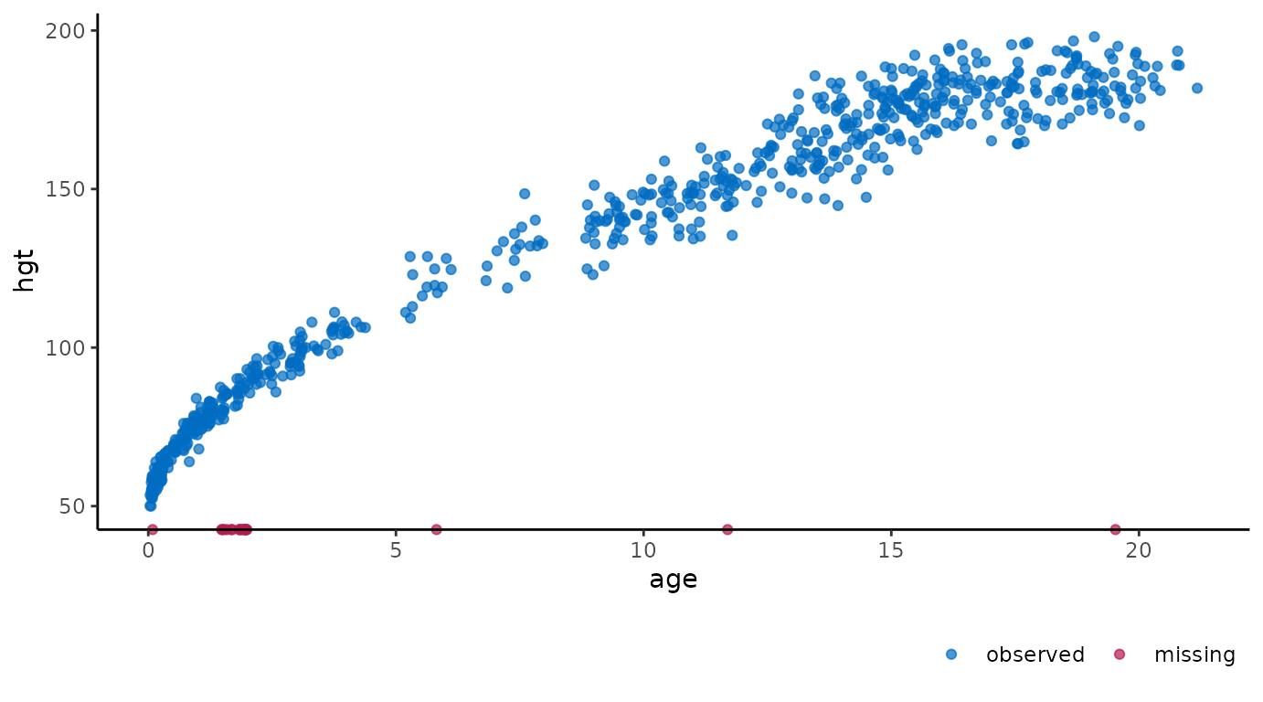
The age of cases with missing hgt are
plotted on the horizontal axis. This is in contrast to a regular
ggplot() call with the same arguments, which would leave
out all cases with missing hgt. So, with
ggmice() we loose less information, and may even gain
valuable insight into the missingness in the data.
Another example of ggmice() in action on incomplete data
is when one of the variables is categorical. The incomplete continuous
variable hgt is plotted against the incomplete categorical
variable reg with:
ggmice(dat, aes(reg, hgt)) +
  geom_point()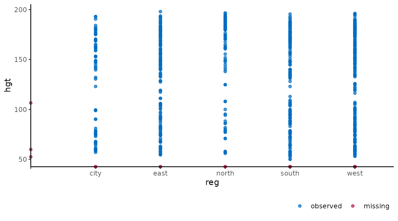
Again, missing values are plotted on the axes. Cases with observed
hgt and missing reg are plotted on the
vertical axis. Cases with observed reg and missing
hgt are plotted on the horizontal axis. There are no cases
were neither is observed, but otherwise these would be plotted on the
intersection of the two axes.
The ‘grammar of graphics’ makes it easy to adjust the plots programmatically. For example, we could be interested in the differences in growth data between the city and other regions. Add facets based on a clustering variable with:
ggmice(dat, aes(wgt, hgt)) +
  geom_point() +
  facet_wrap(~ reg == "city", labeller = label_both)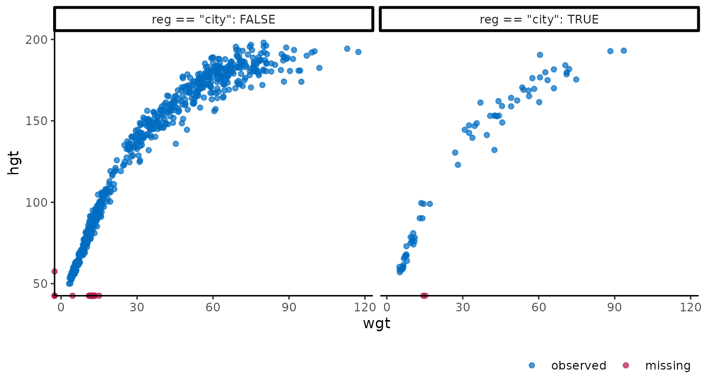
Or, alternatively, we could convert the plotted values of the
variable hgt from centimeters to inches and the variable
wgt from kilograms to pounds with:
ggmice(dat, aes(wgt * 2.20, hgt / 2.54)) +
  geom_point() +
  labs(x = "Weight (lbs)", y = "Height (in)")
#> Warning: Mapping variable 'wgt * 2.2' recognized internally as wgt.
#> Please verify whether this matches the requested mapping variable.
#> Warning: Mapping variable 'hgt/2.54' recognized internally as hgt.
#> Please verify whether this matches the requested mapping variable.![]()
A final example of ggmice() applied to incomplete data
is faceting based on a missingness indicator. Doing so may help explore
the missingness mechanisms in the incomplete data. The distribution of
the continuous variable age and categorical variable
reg are visualized faceted by the missingness indicator for
hgt with:
# continuous variable
ggmice(dat, aes(age)) +
  geom_density() +
  facet_wrap(~ factor(is.na(hgt) == 0, labels = c("observed height", "missing height")))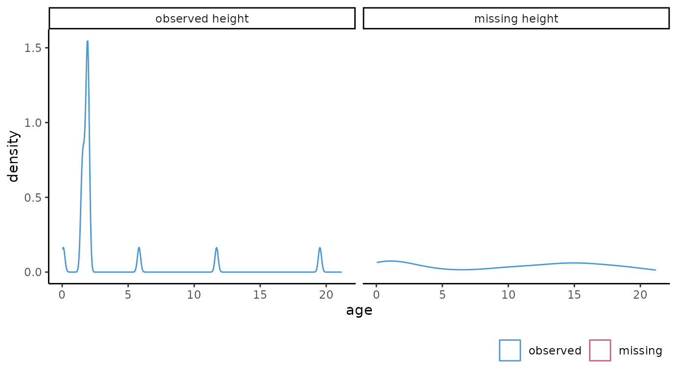
# categorical variable
ggmice(dat, aes(reg)) +
  geom_bar(fill = "white") +
  facet_wrap(~ factor(is.na(hgt) == 0, labels = c("observed height", "missing height")))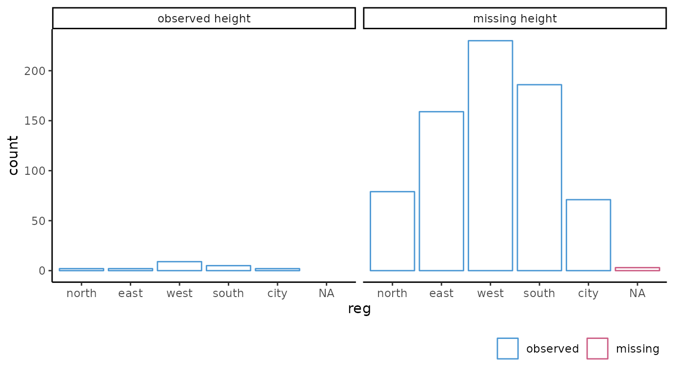
Imputed data
If the data argument in ggmice() is
provided a mice::mids object, the resulting plot will
contain observed data in blue and imputed data in red. There are many
possible visualizations for imputed data, four of which are explicitly
defined in the mice package. Each of these can be
re-created with the ggmice() function (see the Old
friends vignette). But ggmice() can do even more.
For example, we could create the same scatter plots as the ones above, but now on the imputed data:
ggmice(imp, aes(age, hgt)) +
  geom_point()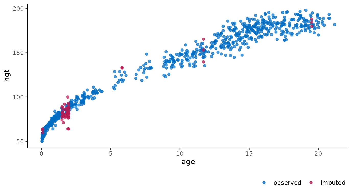
ggmice(imp, aes(reg, hgt)) +
  geom_point()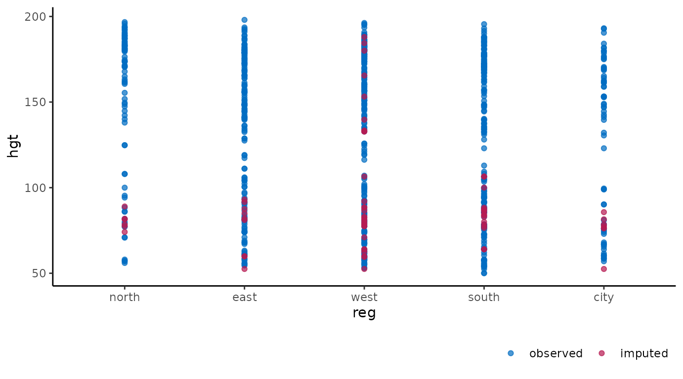
ggmice(imp, aes(wgt, hgt)) +
  geom_point() +
  facet_wrap(~ reg == "city", labeller = label_both)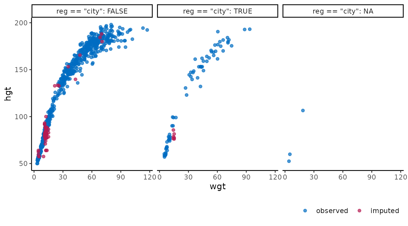
ggmice(imp, aes(wgt * 2.20, hgt / 2.54)) +
  geom_point() +
  labs(x = "Weight (lbs)", y = "Height (in)")
#> Warning: Mapping variable 'wgt * 2.2' recognized internally as wgt.
#> Please verify whether this matches the requested mapping variable.
#> Warning: Mapping variable 'hgt/2.54' recognized internally as hgt.
#> Please verify whether this matches the requested mapping variable.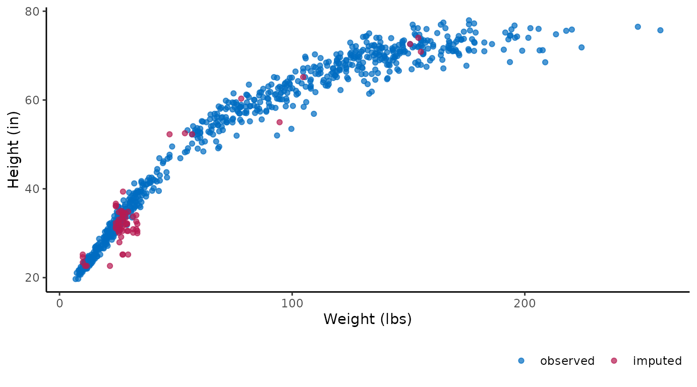
These figures show the observed data points once in blue, plus three imputed values in red for each missing entry.
It is also possible to use the imputation number as mapping variable
in the plot. For example, we can create a stripplot of observed and
imputed data with the imputation number .imp on the
horizontal axis:
ggmice(imp, aes(x = .imp, y = hgt)) +
  geom_jitter(height = 0, width = 0.25) +
  labs(x = "Imputation number")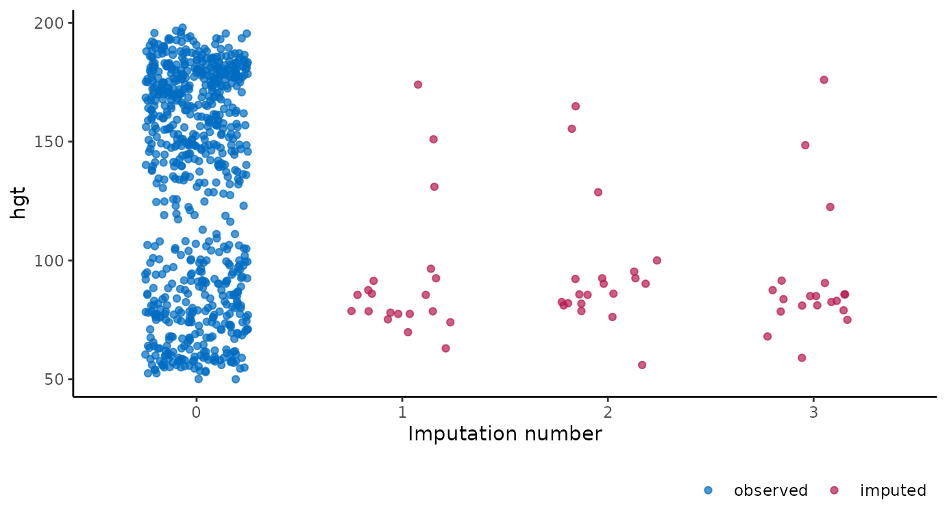
A major advantage of ggmice() over the equivalent
function mice::stripplot() is that ggmice
allows us to add subsequent plotting layers, such as a boxplot
overlay:
ggmice(imp, aes(x = .imp, y = hgt)) +
  geom_jitter(height = 0, width = 0.25) +
  geom_boxplot(width = 0.5, linewidth = 1, alpha = 0.75, outlier.shape = NA) +
  labs(x = "Imputation number")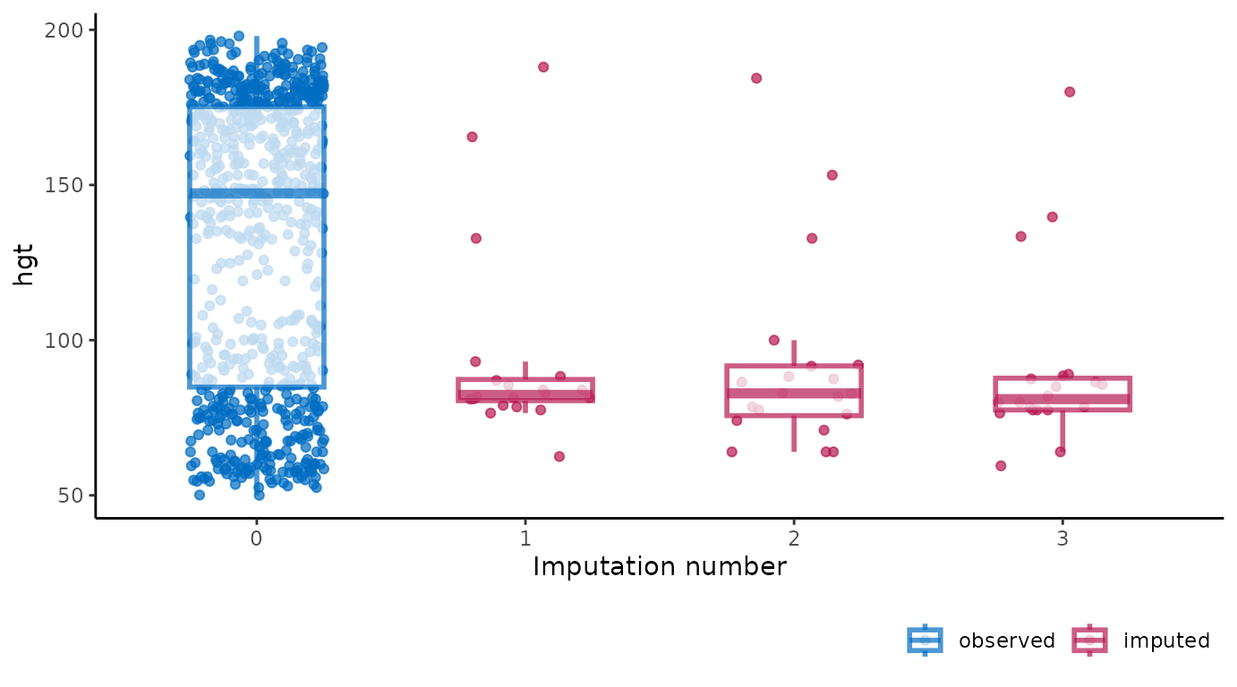
You may want to create a plot visualizing the imputations of multiple
variables as one object. This can be done by combining
ggmice with the functional programming package
purrr and visualization package patchwork. For
example, we could obtain boxplots of different imputed variables as one
object using:
purrr::map(c("wgt", "hgt", "bmi"), ~ {
  ggmice(imp, aes(x = .imp, y = .data[[.x]])) +
    geom_boxplot() +
    labs(x = "Imputation number")
}) %>%
  patchwork::wrap_plots()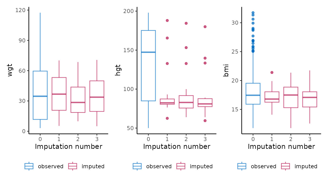
To re-create any mice plot with ggmice, see
the Old
friends vignette.
Other functions
The ggmice package contains some additional plotting
functions to explore incomplete data and evaluate convergence of the
imputation algorithm. These are presented in the order of a typical
imputation workflow, where the missingness is first investigated using a
missing data pattern and influx-outflux plot, then imputation models are
built based on relations between variables, and finally the imputations
are inspected visually to check for non-convergence.
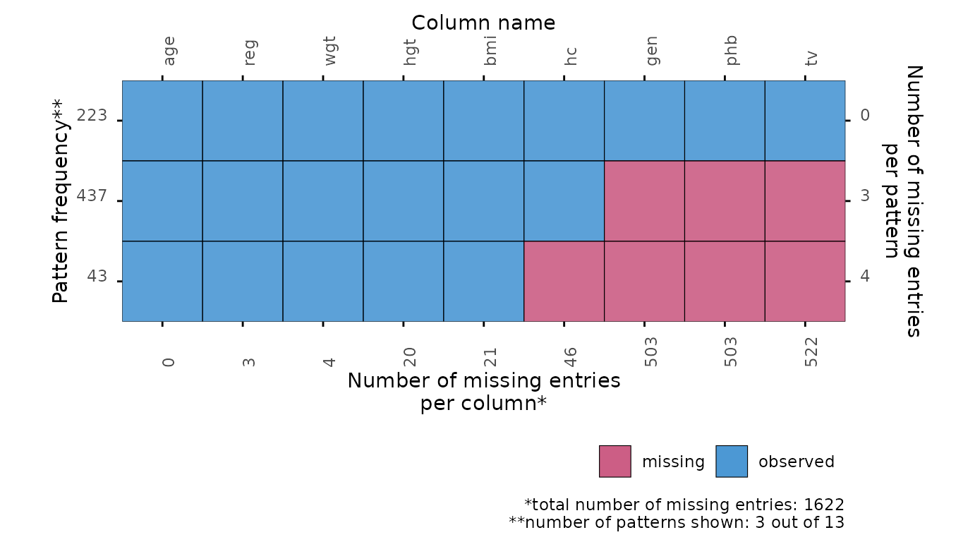
Missing data pattern
The plot_pattern() function displays the missing data
pattern in an incomplete dataset. The argument data (the
incomplete dataset) is required, the argument square is
optional and determines whether the missing data pattern has square or
rectangular tiles, and the optional argument rotate changes
the angle of the variable names 90 degrees if requested. Other optional
arguments are cluster and npat.
# create missing data pattern plot
plot_pattern(dat)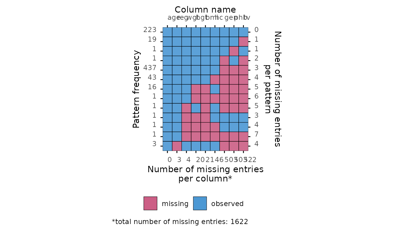
# specify optional arguments
plot_pattern(
  dat,
  square = TRUE,
  rotate = TRUE,
  npat = 3,
  cluster = "reg"
)
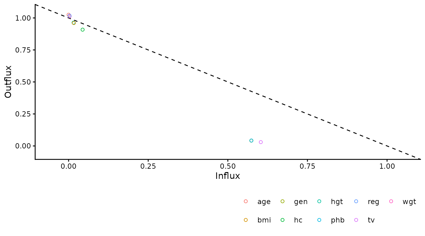
Influx and outflux
The plot_flux() function produces an influx-outflux
plot. The influx of a variable quantifies how well its missing data
connect to the observed data on other variables. The outflux of a
variable quantifies how well its observed data connect to the missing
data on other variables. In general, higher influx and outflux values
are preferred when building imputation models. The plotting function
requires an incomplete dataset (argument data), and takes
optional arguments to adjust the legend and axis labels.
# create influx-outflux plot
plot_flux(dat)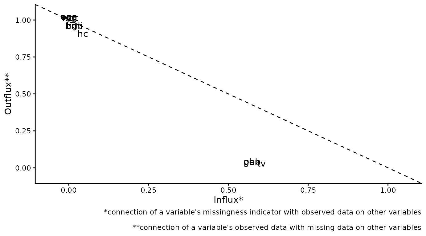
# specify optional arguments
plot_flux(
  dat,
  label = FALSE,
  caption = FALSE
)
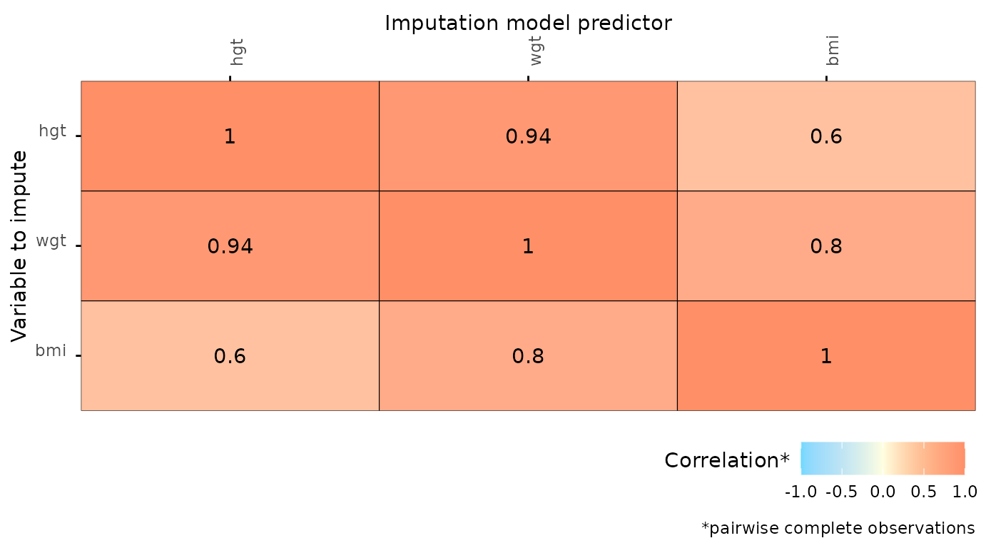
Correlations between variables
The function plot_corr() can be used to investigate
relations between variables, for the development of imputation models.
Only one of the arguments (data, the incomplete dataset) is
required, all other arguments are optional.
# create correlation plot
plot_corr(dat)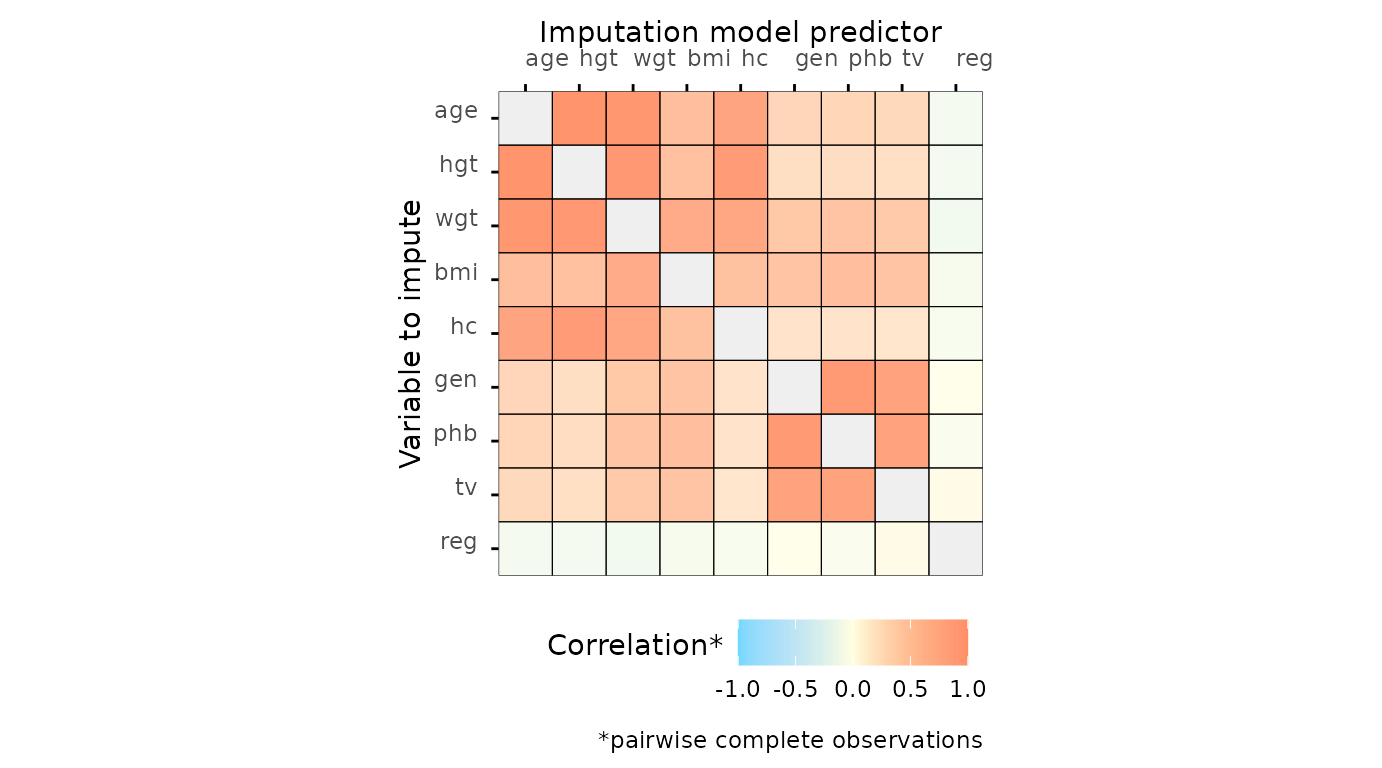
# specify optional arguments
plot_corr(
  dat,
  vrb = c("hgt", "wgt", "bmi"),
  label = TRUE,
  square = FALSE,
  diagonal = TRUE,
  rotate = TRUE
)
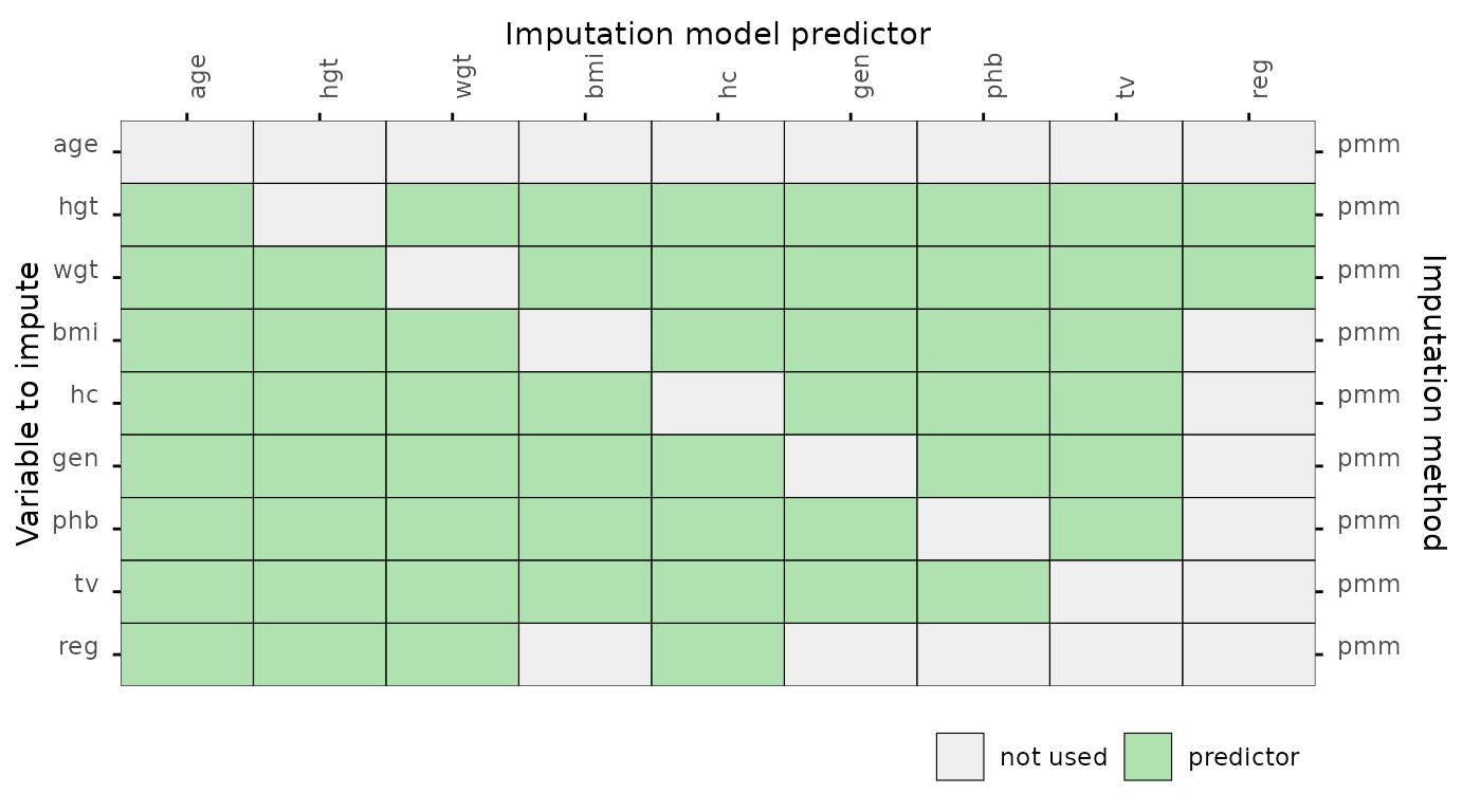
Predictor matrix
The function plot_pred() displays mice
predictor matrices. A predictor matrix is typically created using
mice::make.predictorMatrix(),
mice::quickpred(), or by using the default in
mice::mice() and extracting the
predictorMatrix from the resulting mids
object. The plot_pred() function requires a predictor
matrix (the data argument), but other arguments can be
provided too.
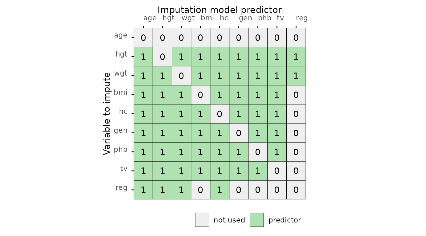
# specify optional arguments
plot_pred(
  pred,
  label = FALSE,
  square = FALSE,
  rotate = TRUE,
  method = "pmm"
)
Algorithmic convergence
The function plot_trace() plots the trace lines of the
MICE algorithm for convergence evaluation. The only required argument is
data (to supply a mice::mids object). The
optional argument vrb defaults to "all", which
would display traceplots for all variables.
# create traceplot for one variable
plot_trace(imp, "hgt")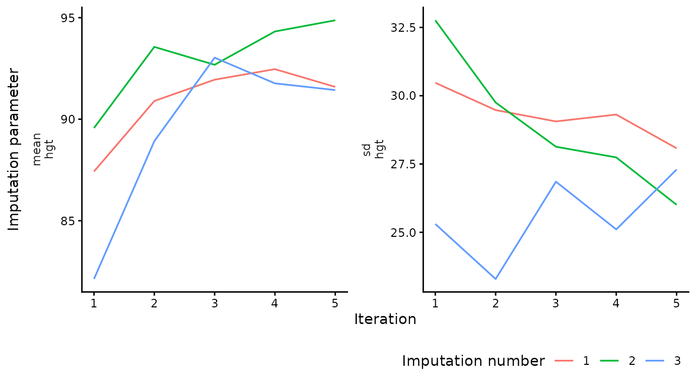
This is the end of the vignette. This document was generated using:
sessionInfo()
#> R version 4.5.3 (2026-03-11)
#> Platform: x86_64-pc-linux-gnu
#> Running under: Ubuntu 24.04.4 LTS
#>
#> Matrix products: default
#> BLAS:   /usr/lib/x86_64-linux-gnu/openblas-pthread/libblas.so.3
#> LAPACK: /usr/lib/x86_64-linux-gnu/openblas-pthread/libopenblasp-r0.3.26.so;  LAPACK version 3.12.0
#>
#> locale:
#>  [1] LC_CTYPE=C.UTF-8       LC_NUMERIC=C           LC_TIME=C.UTF-8
#>  [4] LC_COLLATE=C.UTF-8     LC_MONETARY=C.UTF-8    LC_MESSAGES=C.UTF-8
#>  [7] LC_PAPER=C.UTF-8       LC_NAME=C              LC_ADDRESS=C
#> [10] LC_TELEPHONE=C         LC_MEASUREMENT=C.UTF-8 LC_IDENTIFICATION=C
#>
#> time zone: UTC
#> tzcode source: system (glibc)
#>
#> attached base packages:
#> [1] stats     graphics  grDevices utils     datasets  methods   base
#>
#> other attached packages:
#> [1] ggmice_0.1.1.9000 ggplot2_4.0.2     mice_3.19.0
#>
#> loaded via a namespace (and not attached):
#>  [1] gtable_0.3.6       shape_1.4.6.1      xfun_0.57          bslib_0.10.0
#>  [5] htmlwidgets_1.6.4  lattice_0.22-9     vctrs_0.7.2        tools_4.5.3
#>  [9] Rdpack_2.6.6       generics_0.1.4     tibble_3.3.1       pan_1.9
#> [13] pkgconfig_2.0.3    jomo_2.7-6         Matrix_1.7-4       RColorBrewer_1.1-3
#> [17] S7_0.2.1           desc_1.4.3         lifecycle_1.0.5    compiler_4.5.3
#> [21] farver_2.1.2       stringr_1.6.0      textshaping_1.0.5  codetools_0.2-20
#> [25] htmltools_0.5.9    sass_0.4.10        yaml_2.3.12        glmnet_4.1-10
#> [29] pillar_1.11.1      pkgdown_2.2.0      nloptr_2.2.1       jquerylib_0.1.4
#> [33] tidyr_1.3.2        MASS_7.3-65        cachem_1.1.0       reformulas_0.4.4
#> [37] iterators_1.0.14   rpart_4.1.24       boot_1.3-32        foreach_1.5.2
#> [41] mitml_0.4-5        nlme_3.1-168       tidyselect_1.2.1   digest_0.6.39
#> [45] stringi_1.8.7      dplyr_1.2.0        purrr_1.2.1        labeling_0.4.3
#> [49] splines_4.5.3      fastmap_1.2.0      grid_4.5.3         cli_3.6.5
#> [53] magrittr_2.0.4     patchwork_1.3.2    survival_3.8-6     broom_1.0.12
#> [57] withr_3.0.2        scales_1.4.0       backports_1.5.0    rmarkdown_2.31
#> [61] otel_0.2.0         nnet_7.3-20        lme4_2.0-1         ragg_1.5.2
#> [65] evaluate_1.0.5     knitr_1.51         rbibutils_2.4.1    rlang_1.1.7
#> [69] Rcpp_1.1.1         glue_1.8.0         minqa_1.2.8        jsonlite_2.0.0
#> [73] R6_2.6.1           systemfonts_1.3.2  fs_2.0.1